Liquid Glass Components
iOS-style liquid glass effects for the web using pure CSS SVG filters. Create stunning glassmorphism UI with realistic refraction.
LiquidGlass
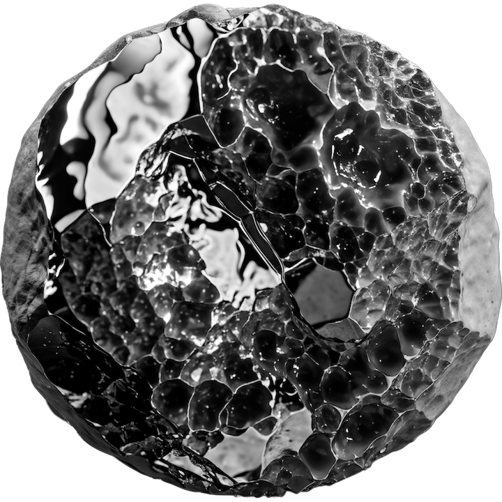
A container component that applies a liquid glass refraction effect with displacement mapping. Perfect for , , and .
Import
import LiquidGlass
  from './LiquidGlass.astro'
Props
class string
CSS classes (use rounded-* for border
radius)
depth number = 10 Depth of the glass edge refraction
strength number = 100 Displacement strength multiplier
chromaticAberration number = 0 RGB split effect intensity (1-3 recommended)
blur number = 0 Blur amount in pixels
color 'white' | 'black' Glass tint color
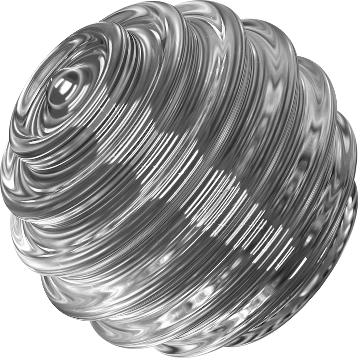
background string Image URL for background with spin animation
button boolean = false Enable hover scale & tilt animation
freeze boolean = false Disable background spin animation
noMorph boolean = false Use lighter overlay style
inline boolean = false Display as inline element for use within text
Basic Usage
<LiquidGlass
  class="rounded-[50px]"
  blur={0}
  chromaticAberration={2}
>
  <div class="...">
    Your content
  </div>
</LiquidGlass>
With Background
<LiquidGlass
  class="rounded-full"
  background="..."
  strength={10}
  chromaticAberration={1}
>
  <div class="w-16 h-16" />
</LiquidGlass>
Interactive Button
<LiquidGlass
  class="rounded-[30px]"
  color="black"
  chromaticAberration={2}
  button
>
  <a href="/" class="...">
    Click Me
  </a>
</LiquidGlass>
Inline Badge
Perfect for highlighting within text content:
<LiquidGlass
  class="rounded-full mx-1"
  chromaticAberration={2}
  button
  inline
>
  <span class="...">keyword</span>
</LiquidGlass>
Installation
LiquidGlass requires and for animations.
Step 1: Install Dependencies
npm install animejsStep 2: Copy Components
Copy the following files to your project:
-
src/components/LiquidGlass.astro— Main component -
src/utils/liquidGlass.ts— SVG filter generator
Step 3: Import & Use
---
import LiquidGlass
  from './LiquidGlass.astro'
---

<LiquidGlass class="...">
  <div>Hello</div>
</LiquidGlass>
How It Works
The liquid glass effect is achieved using applied via CSS .
Browser Support
LiquidGlass uses which has limited support. A fallback using standard and is automatically applied for unsupported browsers.
| Browser | Full Effect | Fallback |
|---|---|---|
| Chrome 76+ | ✓ Supported | — |
| Edge 79+ | ✓ Supported | — |
| Safari 18+ | ✓ Supported | — |
| Firefox | ✗ Not supported | ✓ Auto blur/saturate |
| Safari <18 | ✗ Not supported | ✓ Auto blur/saturate |
Tips & Best Practices
Border Radius: Always use Tailwind's
classes in the
class prop. The component automatically
reads this value for the SVG filter.
Full Width: Use (with important modifier) to make components stretch to container width.
Chromatic Aberration: Values of give subtle, realistic light dispersion. Higher values create more dramatic rainbow effects.
⚠️ Performance Note: SVG filters can be GPU-intensive. Avoid using many large LiquidGlass components on the same page, especially on mobile devices.
Live Examples
Interactive Button
With Background Pattern